How much can a single illustration tell us, and what is better left to the imagination?
For illustrator and character designer Candida Corsi, creating compelling characters goes far beyond making beautiful artwork. With a background spanning publishing, animation and live entertainment, she has brought her creative vision to board games including Rats of Wistar and Ants.
We spoke with Candida about the art of visual storytelling, the challenges of collaboration, the importance of creative freedom, and what it takes to create characters that truly come to life.
You came to board games after working across publishing, character design and live entertainment. What changes when a character is no longer something people simply see or read, but becomes part of an experience they actively interact with?
In my experience of character design, a character belongs to the sphere of ideas, to the narrative behind any creative project. The difference is that, in a game, this core must be schematized into characteristics useful to the game mechanics. In a show, everything must be expressed visually through a costume (which must be achievable). In a book, animation, or film, you go beyond the mechanical level of structure and plot (which is also necessary), and you can choose the precise visual angle that guides the reader or viewer throughout the story, determining everything in advance.
Active player interaction can be minimal and determined only by chance, or maximal and creative, as in role-playing games. In the first case, it is a question of providing a range of possibilities within which the player can move; in the second, the possibilities are infinite. The players actually become authors and build their characters. I find working on board games, on the one hand, more mechanical and schematic, but on the other, more constructive and functional—let’s say, with fewer frills. You operate at a deep level of storytelling to provide players with the ability to change the evolution of events and characters.
I like to consider board games as Vladimir Propp considered fairy tales in his essay Morphology of the Folktale. In fact, Propp theorized that all magic fairy tales share a deep structure made up of 31 fixed functions, always the same. And it is at this deep, structural level that we work in board games to develop characters, while in books and films we start from the structure and then develop an unchangeable point of view that tells more than the plot itself. In board games, however, there are no hidden meanings, intuitions to suggest, or double truths. It’s all much simpler, more linear, and structured.
A character in a board game can suggest personality, role and even how the player should relate to it. How do you approach communicating these qualities through the artwork?
When designing a character, everything takes on importance: clothes, gaze, pose, etc. A bit like in tarot cards, the elements present in the card become symbols that convey and evoke meanings, even very distant ones. So in the layout of a game character you have to play a lot on a symbolic level. This can involve both the outfit and the objects and tools used by the character. While in a book this may or may not matter, much more is played out through character, attitudes, looks and expressions.
“It’s like trying to discover the secret ingredient in a recipe.”
Is there also information about a character that you deliberately wouldn’t try to communicate visually because it is better for the player to discover it through the game itself?
That’s a rather difficult question. It’s like trying to discover the secret ingredient in a recipe. However, I think it’s “simply” a matter of balance between what is said and what is left unsaid. This applies to character design, but also to writing, whether for a film script or a comic book, and who knows what else.
Generally speaking, once that balance is struck, clothing and gear are used to convey explicit information, while posture and expression help communicate the implicit. Symbolic details then reinforce and enhance both aspects.
In fact, the famous “show, don't tell” writing technique points to exactly this, and it holds true for visual communication as well. It compels one to adopt a non-descriptive approach, even when creating images.
To explain further: a descriptive image is static — everything is perfectly visible and in its place, describing a character, a setting, or the game as a whole. An interesting image, on the other hand, hints at actions past, present, and future relative to the moment depicted; it uses dynamic poses and expressive faces, and might obscure the present to reveal the future or the past. For instance, you might not know what lies behind an object or a person, but if a character is looking at something unseen, their expression reveals a great deal. Another example is an image where all the elements and characters are looking out of the frame; this builds anticipation in the viewer, who then looks at the image, waiting to understand what is happening.
Ultimately, then, I would say that the famous secret ingredient consists of the things left unsaid or unseen — elements that require an imaginative effort from the viewer.
You once said that you try to create images that are able to communicate on their own. Since then, you have worked on games ranging from Point Art, where communicating visually is central to the experience, to much denser strategy games such as Rats of Wistar and ANTS. Has working across those extremes changed what “an image that communicates” means to you?
Not at all. I always firmly believe that an image should not need further explanation, but should be able to at least sustain a story on its own. But it's true that I didn't work on these three games with the same attitude. I really cared about Rats of Wistar and Ants, because they are games that have a strong and complex narrative, and as a result the images are much more communicative than in Point Art.
The moment I begin an illustration, I always try to immerse myself narratively in a “situation”, rather than a scene. I imagine things and add many details of my own free will that help give substance to the scene and intrigue the players. This is greatly appreciated (at least so far) by the publishers and game designers I've worked with. I like to create images in which, every time you look at them, you discover a new detail that you hadn't seen before.
Artwork makes a promise about a game before anyone has read a rulebook. Rats of Wistar, for example, is a substantial strategy game presented through warm, expressive characters. How do you make a complex game feel inviting without giving players the wrong impression of the experience waiting inside the box?
In my opinion, complexity helps make a character alive, and if used well, it doesn't scare; in fact, it intrigues. In my experience, board game players are hungry for complexity. They are not intimidated by a long manual; the important thing is that it is well drawn and written.
Drawings play an important role in this, because memorizing a well-drawn symbol, icon, or character is easier than memorizing a set of rules.
“The key ingredient for a cover isn't complexity, but beauty.”
Thinking specifically about the first impression a game creates before someone knows the rules, how do you decide what the cover and character art should communicate about the weight and tone of the experience inside the box? Does the artwork need to signal that complexity at all?
I believe that when dealing with complex characters and evocative imagery, the expectation is for game mechanics that are interesting rather than merely complex—though the two don't always go hand in hand. That said, within the gaming world, game complexity and rule intricacy are seen as both added value and a way to categorize a game.
The artwork helps define the target age group and the setting, but above all, it must create appeal. In the "expert" category, this effect is sometimes achieved by using a striking contrast between the visual style and the mechanics; for instance, there are "expert-level" games that feature simple, playful artwork.
Ultimately, however, I think the key ingredient for a cover isn't complexity, but beauty. Whether the cover image is simple or complex, it must be beautiful and draw you into the game's setting; the complexity of the mechanics only comes into play after attention has been captured.
You and Sara Valentino worked together on Rats of Wistar. How was the illustration work divided between you, and how did you make sure your individual styles worked well together?
I worked on the character design, on the game board and player board, on the cover and on the cards (aim cards, event cards and hero cards), while Sara worked on the object cards showing the objects made by the rats. There were really a lot of them: 180 Invention cards.
It wasn't easy working together on a single project, but luckily we were helped and coordinated by an excellent art director, Arianna Santini, who was able to smooth out the corners and make everything run smoothly.
“I never know how much of a struggle it will be to secure the creative freedom I so deeply desire.”
Did you and Sara work in a similar way on Ants, or was the creative process different for that project? And did working together on two games change the way you approached creating a coherent visual world across different artists’ contributions?
For both Rats of Wistar and Ants, once the character design and style—which I handled—were established, each of us managed our respective parts independently, while always coordinating with the art director. I believe this is evident in both games; our individual styles remain recognizable yet never clash.
For Ants, Sara handled the 120 Base cards and the 30 Starting cards. I took care of everything else.
Teamwork hasn't changed my creative approach—partly because every project is unique, and I never know how much of a struggle it will be to secure the creative freedom I so deeply desire. I’ve worked in teams on animation projects and on the development of theatrical productions for Franco Dragone; while it isn't something I particularly love, it undoubtedly enriches the process, allowing me to break out of my usual patterns and experiment with new things.
Unfortunately, in artistic work, striking a balance between one's own ideas, the producer's requirements, and audience preferences is challenging—yet it is precisely this pursuit that yields the best projects.
Across those games, you work with animals that can be portrayed anywhere on the spectrum between recognisably animal and strongly humanised. What determines where you place a character on that spectrum?
Certainly, the decisions made by the game designer and the publisher come first. Then the character designer finds a visual balance between the various inputs received. Here too, Arianna Santini (art director) played a fundamental role because she was able to combine the imaginative part with the gameplay features very well. We discussed a lot about the degree of humanization of both rats and ants. I did various tests during the character design phase of the rats, while for the ants it was easier. I believe that in a game, as in a book, the accurate choice of position on this spectrum is the decisive choice to make before even starting to write the narrative of the game or the book.
When a publisher looks at early character concepts, what should they be evaluating beyond simply asking, “Do we like this style?” How do you balance their expectations with your own creative vision?
It's an inextricable set of factors; there isn't a single useful feature. In general, I think style is something that grows with the project. It's a shame that it's not always possible to get so much trust from publishers. I try to find the middle ground between the reasons the publisher contacted me and the adaptation I feel I want to give to the individual project. It's not always an easy compromise, because tastes change, style evolves, and the expectations of publishing house development teams are always very high and precise. But you have to dare, even at the cost of losing some work, because the search for style has always been better than endlessly copying yourself. At least I hope...
“We must stand out for our human characteristics, not our technique.”
For illustrators who want to become genuinely strong character designers, what should their work demonstrate that a portfolio filled with beautiful standalone illustrations might not reveal?
During this period, more than ever, they should demonstrate their imaginative skills rather than their technical ones, and have a recognizable but not repetitive style.
Unfortunately, we are competing with artificial intelligence, and if we want to continue working, we must stand out for our human characteristics, not our technique. Otherwise the battle is already lost.
After working across books, live entertainment and board games, what kind of character or world would you still love to create next?
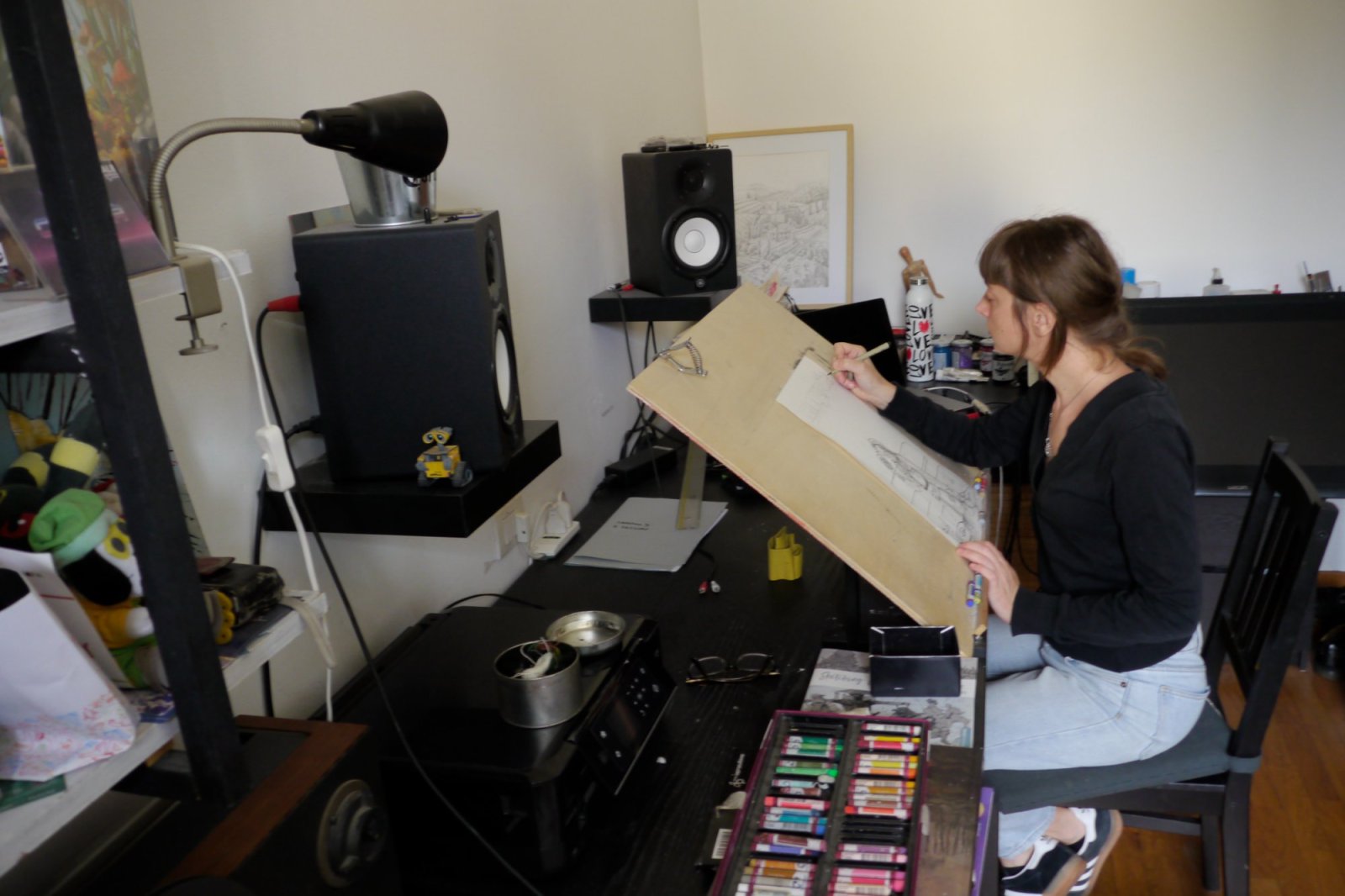
I'm working on some projects of my own that I've had in my drawer for a few years. In particular, two graphic novels. The first, The Meal, is serious and introspective, drawn entirely by hand using oil pastels and ink. It's a surreal story about personal growth, based on the metaphor of an insect transforming into a man, thereby inverting the original Kafkaesque concept of metamorphosis. I used human and animal characters that mix in a succession of metamorphoses in which the form always changes, but not the substance. The repetition of situations creates an oppressive atmosphere that reflects the difficulty of overcoming one's mistakes to arrive at a true evolution of character.
The second, Moldiness, is instead comical and funny. It's about mold's attempt to take over the world from a refrigerator where food was forgotten before leaving for summer vacation. But the whimsical and eccentric mold characters haven't come to terms with the austere protectors of food safety, preservatives! Who will win?
To my mind, this setting would also be perfect for a Risk-style board game, where players battle against the Preservatives to conquer the fridge.
This is the first time I've invested time in projects of my own, and I hope to find a publisher soon.
A closer look at Candida's personal projects
Beyond her work in board games and illustration, Candida Corsi is developing two personal projects, each exploring a very different world.
The Meal — Graphic novel
The Meal is a surreal story inspired by Kafka's concept of metamorphosis, but with the transformation reversed: an insect becomes a man.
Its protagonist, Gregor, recounts a series of transformations through different animal forms before becoming human. Dismissed as insane, he finds an unexpected connection with Eleonora, a young woman struggling with eating disorders.
Through their unconventional relationship, Candida explores adolescence, addiction, and the difficulty of overcoming deeply rooted patterns. The story uses physical transformation as a metaphor for personal change and the struggle to leave part of oneself behind.
Moldiness — Graphic novel / board game concept
When a family leaves for summer vacation, forgotten leftovers in their refrigerator begin to grow mold. From this emerge colorful characters who build fantastical worlds on the food they colonize.
But their world is threatened by the Preservatives, austere politicians with 19th-century features who offer fresh produce protection against decay. The price? Losing their freshness and vibrant colors.
Will the molds transform and enrich the food, or will the Preservatives prevail?
No comments yet. Be the first to share your thoughts.